Which Nude Men are the Best?

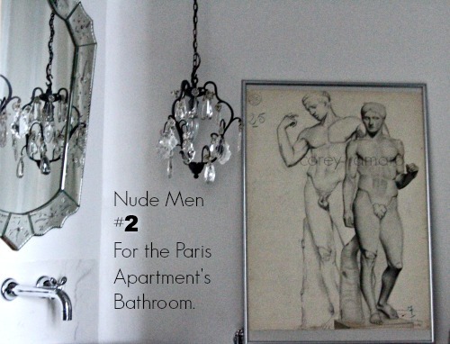
Nude men for the bathroom 2


Pretty funny title for a PG rated blog don't you think? I wanted your attention. Kind of like screaming, "Wolf!" Because I need your help, I am not in trouble or anything serious like that. You see, I bought a bunch of 1900s French charcoal drawings several weeks ago at the brocante, though I only want to use one of them for the bathroom in Paris. 


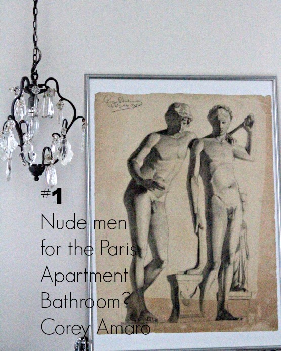
Pair of nude men 1


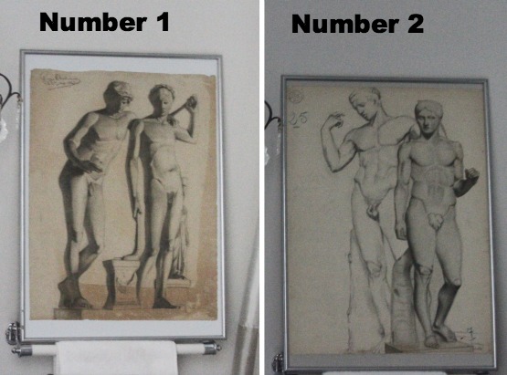
I narrowed it down to two of them. The two charcoal drawings are similar, both are signed and dated 1887. Maybe that is why I cannot make up my mind, I like them both.

The other charcoal drawings are either far more in your face, if you know what I mean. Not bad. Just more prominent, aggressive, attention grabbers. Or they are of women and I already have women in the bathroom at home, so I thought I would add men this time. The others are simply not my first choice.


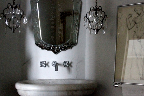
Bathroom Paris apartment corey amaro


 Sacha's girlfriend (Yes, he has a girlfriend and she is lovely! That is all I can say about that subject on my blog.) Came by the apartment and she made a statement that made me laugh at myself, Observantly she said, "The apartment looks just like your home back in Provence: Paris map on the wall, ironstone, linen curtains, black table with beige chairs, nudes…" Sacha added, "Mirrors you cannot see yourself, old chic stuff…"

I thought the Paris apartment looked different then our home, darker, different colors, but after she mentioned that it looked the same, I had to agree it does! Except there will be nude men in the bathroom, not just women.

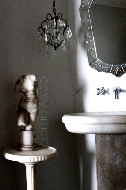
The marble side table, next to the holy water font re-purposed into a bathroom sink, I bought this summer at a brocante for 50 Euros. Since the bathroom sink doesn't have a counter, a side table was needed to put our toothbrush amongst other things. There is a toiletry cabinet next to the sink… photos will come later.


Bathroom Corey Amaro Paris


Which nude men should I use? Wait a minute that is not what I mean! 

Which charcoal drawing should I use for the bathroom?


Nude men charcoal drawings

Please let me know, in the comment section, which one you prefer.

(They are in not matted or framed properly, as I haven't decided which one.)

Doesn't Number 1 or Number 2 sound like bathroom talk?

My Brother Mat will probably say, "Flush them," or something of that nature. I am ready for the jokes.


P.S. Sorry for the number confusion, I have corrected my error. 


Comments

102 responses to “Which Nude Men are the Best?”

  1. I think that the No. 2 nudes are more attractive. I like the composition.

  2. number 2 but i have to be honest & say in both drawings, the poses strike me as awkward. number 2 less so.

  3. I think # 2 is better. # 1 looks like the two men are getting ready to be sexual. Uh…well there I said it. Now I’ll be getting dirty comments/jokes instead of you.
    Take care

  4. #2 has strenght, beauty, and an interesting focus.
    #1 has the gentleness of the adolescent male.
    If I’m in the bathroom I would prefer # 2’s company.

  5. Number 2, the composition is more pleasing.

  6. number 2 please-

  7. Iowa Julie

    Without doubt, Number 2.

  8. #2 if it is to be hung on the right side of the mirror. It takes the flow of your eye better to back across the top of the mirror.

  9. I like No. 2 – makes more of a statement – more virile !
    maria

  10. Don’t like number one at all, very awkward poses, Number two is fine

  11. No.1 – so that you can send No.2 over here to me!

  12. I’m going to make my choice using the very last photo of the nudes. The numbers are turned around in this photo compared to the very first two photos in your blog.
    I’m going with #1. It shows much more class and to me is a better choice artistically and it also looks like they are having a conversation and it makes you pause and wonder what it is they are talking about?

  13. Yep. Number 2.

  14. I think you have the choice numbers switched between the beginning and the end of your post.
    Number One at the top of your post is a drawing of two statues in the Louvre: The Spear Bearer and Hermes Logios. Both are Roman copies of earlier Greek statues – you can always tell Roman marbles because they have supports carved as additions, like the tree trunks you see here.
    Anyway, my vote is for the two statues.

  15. At first I thought #2, because the poses look more interesting/natural and something that a male couple might like to have in their home. But then in another of your shots I saw a corner of #1 in the actual space and I I thought the more classical nature of that one better suited where you are putting it.
    Either will look gorgeous in there, especially if framed with wide matting of your choice.
    No matter which, your bathroom will be well hung 🙂

  16. Corey, I think you switched the labeling, first calling the hand on shoulder pose (with part of a third stature seen behind the other 2) #2 and then at the end of the post calling that one #1?
    (My answer refers to the numbering how you had it at the start vs. how it is at the end.)

  17. LauraInSeattle

    The second #1 or the first #2….I think they’re reversed at the bottom. My vote is for the “bromancy” dudes.

  18. # un definitely. It looks classier and more complete. The second one, the second figure looks like it hasn’t been completely sketched or is to look like a shadow.

  19. Hi, from your two numbered choices, I like No. 1. I like the classical feel of those guys. No. 2’s information just shoots right out into your face . . . might have to leave the door open if I was in there with them. Ha

  20. The one with the lighter drawn flexing bi-sep gent on the left. #2 in the side by side photo.

  21. I’d go with number 2. I find number 1 awkward and honestly, who choose only one naked man when you can have two??

  22. number 2, for many of the reasons others have mentioned plus I like the idea that it does not look “finished”

  23. Number 2….they look like manly men!

  24. #2 – no doubt about it

  25. sandy austin

    I like both pictures but I prefer #2, its more balanced. Just incase you have children staying at the apartment you might want to place a flower with a peel off back to stick over the uhm uhm parts. It will save the parents from having to explain. You can leave the flowers in a jar, so all of us will know where to find them. Lol. Love the bathroom…

  26. And you can’t hang both of ’em because???

  27. No. 2

  28. No.2 please. I like to think that someday I will meet them in person…I mean see them(in the charcoal drawing)in your lovely Paris apartment. 🙂

  29. Number 2. One has an appendage that looks odd…

  30. paula s in new mexico

    #2 without a second thought!

  31. Brother Mathew

    Really? You want all that junk just hangin?

  32. The one that looks the most like F.H. of course !

  33. Neither. I would explore other options like a poster of a famous movie i.e. Casablanca or some other vintage movie poster. I wouldn’t have nudes on my walls – just my preference.

  34. Love them both but #2 is stronger. Such decisions!

  35. Dawn Fleming

    I prefer number 1

  36. #2, number one looks like I would say emasculated men, but defeminized women is more correct…

  37. No 1. It is more shadowy and the figure on the right looks like he is scrubbing his back.

  38. Allison in SF

    Number 2 definitely has a more classic look. The guy is leaning over in a weird way in number 1…

  39. one must always have sets of nude men in powder rooms. two seem slightly churlish to the other pair not selected. i say follow nureyev- he was exquisite and knew how to hang to hang nude men appropriately in his paris flat. they both are fabulous studies and both should be properly displayed.
    Kurt

  40. #1 my eye went to it immediately. I love them both.

  41. #2 for sure !

  42. XiijnTEXAS FRANCOPHILE

    UNO

  43. Number 2. They look beefcakier, and the number 1 fellows look a little undernourished.

  44. Number 2!

  45. No. 2. 🙂

  46. While I like the yellowing of the paper on number 1 the composition and the execution of the drawing is better on number 2. I also think the position of the subject on the left in 1 is a little awkward! So…..I would say 2!!! love Black as well and though I probably wear more color than you I have a black bathroom, even the ceiling! With the inside of the cupboards and drawers painted pink……

  47. This Canadian unfettered: deux, s’il vous plait.
    Still laughing at brother Mathew’s comment.

  48. I agree with Ann. I would prefer something else – not nudes.

  49. Marjorie Sue

    I’ve been a figure painter for years and have done hundreds of charcoal sketches. Observing the two photos this is my take:
    #1…Has a very lineal and stiff feeling with sharp shading, but better poses and compostion.
    #2…Has a softer feeling with more flowing lines, very “Davidlike” (a new word!). The poses are ok, but don’t leave any interesting spaces around the figures. The stump at the foot of the figure on the right is very ackward and adds nothing to the overall composition.
    That said and my critique done, I think it might be easier to live with #2 if you want a softer feeling, but if you want a more crisp feeling..#1.
    That’s my critique and I’m stickin’ to it!

  50. Nr 1 definitely. The yellowed, aged paper makes for a less b/w stark look. I also think they look more like ancient gods or Olympians at rest (the figure on the right almost seems to have a drape – hamman towel! – slung down near his feet so perhaps more bathing room suited. The other sketch is a bit harsh, clearer b/w and perhaps more formal a pose suited to a study or hall? I’d go for the relaxed poses of Nr 1.

  51. I’d go for No 1 – they look more patient. Perhaps they’ve already finished showering. No2s look like they’re waiting for you to hurry up and finish already so they can have a turn!

  52. no doubt – no 1 – I wouldn’t want having those men’s vital parts of your no 2 proposition see hanging in front of my face (or anywhere else…)
    🙂

  53. Jennifer Phillipps

    I have to go with No 2 by a pubic hair! They are actually both very charming and I would have to say I agree that it would be good to find a way to hang both as they do really make a statement together.
    Looking forward to further photos of the finished space….very impressive thus far…particularly love the bathroom sink/font..looks fabulous!
    Cheers

  54. #2. Better composition, to me.

  55. i vote #2, they seem less like theyre staring at your junk 🙂 did you choose a sofa?

  56. I think #2 is easier to look at. #1 looks too angular to me, more contemporary looking.

  57. I like them both but Number 2 is my favourite.

  58. No. 1. as someone said, side view is more appealing.

  59. Niki Weippert

    Loved reading all the comments! I’m surprised that I disagree with most everyone. I think the “royal flush” should be #1! I think that #2 looks like “number 2”! Just kidding. I know with your taste which ever one you chose will be perfect.

  60. Jean Munroe

    For your bathroom, number 2. It is softer and fits in better. Number 1 is heavy on the chiaroscuro and looks like something from the ’30’s. Too harsh for your setting but I actually like it better — in a different setting, though.

  61. I like #1 better. #2, with all the muscles, it makes the junk stand out more! It’s so funny to read all the comments about “junk”!!

  62. Neither…for all the too obvious reasons…

  63. #2 is the better work of art, #1 appears to be by a less experienced hand more intent on the drama of light and shadow with more angular line lacking the organic feel of the subject matter.
    (But they’re both cool!)

  64. I vote for number 2. I’ve been reading the comments to my husband and we’re still laughing 🙂 Can’t wait to see the whole apartment!

  65. Number 2, Corey! For all the reasons already stated.

  66. well, it looks like #2 is winning, but I prefer #1 because it is more unique. I have seen so many like #2…but #1 has it’s own unique story to tell. It is old but somehow very very current…it is very real rather than a classical study. Who were these men and what were they sharing at that moment? What is their particular history? #2 is pretty…typical…But #1 is interesting…intriguing…even challenging.
    I always lean towards what is unexpected and interesting…what might stir one’s senses. 🙂

  67. v.j. kohout

    Most definitely number 1. Much more interesting.

  68. Scrolling down I saw a lot of number two BUT NUMRO UNO is my favorite……..more refined,less offensive.I do not like the guy on the right in number two!!!Your bathroom is loverly…….cant believe I did not take photos!!!This will be an added attraction!YOU PAID 50 EURO’s for that sink????YOU SCORED MADAME YOU SCORED!!!!BRAVA!
    XXX

  69. 1 is good. 2 is too real to your bathroom….like a hospital or something…..that i feel.

  70. NUMBER TWO!!!!! Hands down!!!! Or, hands on! I bet this is definitely the one you considered more in your face! So French! So sexy!

  71. #1 is fun, playful and casual…; #2 is an oft-seen classical view. I vote for the first for all the reasons mentioned by others, as well.

  72. Irene Thomas

    Depending on where the toilet is situated, do you want your male visitors to be facing the sink or the toilet? We always have to remind our men where to point, don’t we?

  73. Kristen Crumly

    Definitely like #2 better

  74. Christine LeFever

    The first one since one of the men in the second one looks too female.

  75. Christine LeFever

    I goofed. Reverse that. The second one. It pays to read all of the words!

  76. I love #1. There is something that strikes me as more casual about that drawing. And though I generally love the classical lines and proportations that #2 displays, in this setting, I vote for #1

  77. le 2 est beaucoup plus beau corey sans probléme.

  78. I vote for #2

  79. I’ll put in my little 2 cents
    I like the guys on the right Number 2

  80. I love number 2! The bath looks wonderful as I knew it would, Melinda

  81. Franca Bollo

    Franca’s holding out for the in-your-face versions before casting her vote.

  82. Which Nude Men are the best?
    REAL ONES!!
    Oops. . . were you referring to the prints?
    Okay, I’d say #2

  83. Cathy Baker

    The guys in #2 have better muscles.

  84. Hmmm… No 2. although if the picture was mine I would be tempted to add a “Figleaf” to each
    man – paper or lace – so people could peek or not.

  85. Stephanie M. (Texas)

    #1. Softer on the eye to me…. Just sayin.

  86. Number 2, love the mirror and lights, OK I love everything you have done with it. Lyn

  87. Wow! You put naked men in the title and look at all the responses. LOL! I prefer #1. It is more relaxed, friendlier. It is also more unique, less art group figure study. Have fun!

  88. I think number one has more of a “just out of the bath” feel and thus would be my choice for the bathroom.

  89. Julie Loeschke

    Number 1. More interesting and less formal. 🙂

  90. My vote is for number 1 — it’s more unexpected and thus more interesting. It’s a more unusual pose, the paper is more yellowed, and the beautiful deckled edge shows.
    Number 2 is beautiful too, but I think it would seem too expected, even if the male form in that drawing is umm, more hunky. 😉
    Have to say — LOVE, LOVE, LOVE your design sense (it’s like you are my design twin!! oh how I love these posts!)

  91. Rebecca from the pacific northwest

    Franca Bollo’s answer is why I want to be friends with her.

  92. Rebecca from the pacific northwest

    Maybe just this video running all the time on a screen on the wall: http://www.youtube.com/watch?v=9PVhIMr4ScI
    (I think I got this from your facebook post, Corey.)

  93. Rosemary P

    Yes, how about both?

  94. Lindy Rogers

    # 2 but can’t we use them both?

  95. Country French Judi

    OK I think #2 looks like a nub with swollen testicles. I think #1 is more natural looking. HOWEVER you do need to be mindful of where you hang the pic because little children will question it. My answer would be ” Hey this is France and that is what the french people do!!”

Leave a Reply

Your email address will not be published. Required fields are marked *