The Kitchen in Cassis


Kitchen, French design, Modern with Antiques, Corey Amaro


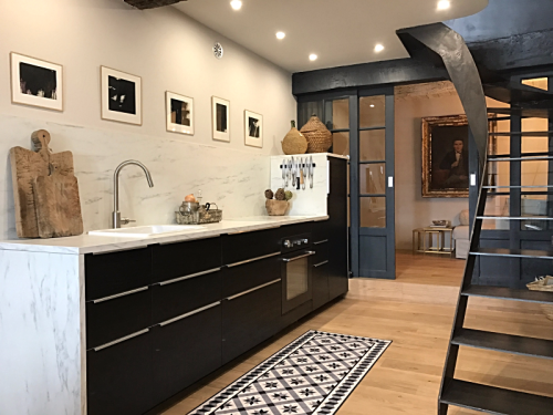
The kitchen in Cassis, and in the back the den which for the moment has a sofa that turns into a bed and end tables. The French doors slide shut and there are curtains on the other side for privacy.


Kitchen, French design, Modern with Antiques, Corey Amaro


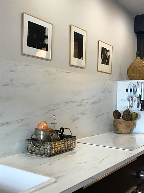
The kitchen is completely from Ikea, the black and white paintings are from Camille. 


Kitchen, French design, Modern with Antiques, Corey Amaro


The entrance is the grey/blue door on the right hand side. 


Kitchen, French design, Modern with Antiques, Corey Amaro


Kitchen, French design, Modern with Antiques, Corey Amaro


Kitchen, French design, Modern with Antiques, Corey Amaro


Kitchen, French design, Modern with Antiques, Corey Amaro


Kitchen, French design, Modern with Antiques, Corey Amaro


The cigalle is a symbol of good luck, I hung it above the entrance.


Kitchen, French design, Modern with Antiques, Corey Amaro


The dining room table light has yet to be hung, therefore I have a lamp on a little table until the light is put up. It isn't going to stay there. The big starburst mirror we are not going to keep, instead we are going to hang a painting.


Kitchen, French design, Modern with Antiques, Corey Amaro


That is the window I found that matches the one upstairs. This one has interior shutters. It is from the 1700s.

The long number piece is for nearly 20 feet high when stretched. It is a geography measure.

The cherry wood table is from the 1900s. I bought it at a second hand store, it opens up if need be. The chairs are new: Black seats with a wooden base.


Kitchen, French design, Modern with Antiques, Corey Amaro


Those are the two beams we had to replace. The cupboard on the left is where I have our dishes. It is a bathroom cabinet from Ikea.


Kitchen, French design, Modern with Antiques, Corey Amaro


The painting will go up and the mirror will go back to the shop.

French Husband prefers the painting. 


Kitchen, French design, Modern with Antiques, Corey Amaro


The square on the wall is where the electrical counter is. 

I have yet to find something to hang there. 


Kitchen, French design, Modern with Antiques, Corey Amaro


If you have any questions, I will answer them in the comment section.


xxx


Comments

62 responses to “The Kitchen in Cassis”

  1. LauraInSeattle

    OMG! Your signature style is amAzing!

  2. Gorgeous! I agree with Yann , painting will be a better fit than the starburst mirror.

  3. Jacklynn Lantry

    The very first pix of this place made it look so tiny. Your vision has transformed it to a light, airy, roomy space! It’s like a magic trick. You two are amazing together. Yes, I think the painting will be nice. The mirror seems huge (could be the perspective of the photo.) Corey, you are amazingly talented. I would have passed that place up as not big enough, too much work, nearly impossible, etc. etc. etc. What a fun trip this has been, thank you so much!

  4. Congratulations Corey & Yann it’s a triumph!!
    But I really like the mirror!

  5. It is lovely and the painting will add to the feel of it!

  6. Beautiful! The color combination is great. What is across from the counter, under the stairs? A cart of some sort?

  7. It is gorgeous! Everyone involved made a dream come true. You can all be very proud.

  8. valywho@comcast.net

    I love the mirror on the wall. What a neat place you have!

  9. Dianne D

    I love the den.
    Is there a microwave in the kitchen?

  10. Looks absolutely amazing – I too like the mirror – could that work on the other side of the wall to help bounce light around? What a wonderful job you have all done – opening it up has really created a feeling of space and light!

  11. It’s fantastic. I love the mirror but I think a painting would look better. How old is the mirror and how much are you selling it for? Would it fit in a suitcase? The Cassis House is Tiny Perfect.
    You really are truly gifted. What a wonderful story from beginning to end. Thanks for sharing with us all
    Ali

  12. Brava, Corey! So well done! How do you like cooking on that stovetop? I’m assuming gas wasn’t an option – or were you just going for a cleaner look overall? The place looks wonderful – a beautiful retreat, in a perfect location.

  13. Diogenes

    Unbelievable. It looks 3 times as large as the original. Love the look. I like the starburst mirror, but maybe the painting will be better.

  14. It is absolutely beyond stunning. You have impeccable taste. It looks like the most perfect idyllic retreat. Will you be renting it out? If so I shall certainly mention it to anyone who asks me for places to stay in the south. Such a huge achievement, I can imagine every time you go there and step inside you just want to stand and look, I would, it is, as I said, so gorgeous!

  15. You did a great job. It has just the right amount of furniture and open space. Everything works together so well.

  16. reneesmcleod@gmail.com

    Wow Corey–you two need to open your own interior design/home renovation firm. The Cassis place is fabulous!!!!! Are you going to rent it out?

  17. Yes it is a small dessert counter. I have an iron shelf piece that will go there, but for the moment we are using the small counter.

  18. We never have had a microwave, nor dishwasher… we are weird like that.

  19. Hi Debbie,
    Neither the painting, nor the mirror will work as that square trace is an “invisible” door to hid the electrical panel etc., as it is low, the mirror or painting would be too low if hung.

  20. Hi B
    Gas wasn’t an option. And we did want a clean look. I am getting use to it. I prefer gas. Ask me in a few months, right now I am 50/50 about liking and hating it. Easy to clean though.

  21. Thank you and everyone for the generous kind comments. I appreciate your attention to our work. We do not think we will rent it out, maybe with the exception to close friends and family.

  22. Hi Renee, No, we are not going to rent it out. Not yet at least. xxx

  23. Ellen Cassilly

    Cory,
    Oh Em Gee
    What a complete Lee fabulous transformation you have done. I haven’t read your blog in a while and pulled this up today. I can’t wait to go back to read past posts regarding the renovation.
    I think a mirror on one of the walls in the dining area is really a good idea. I like the mirror you have although I agree with you about the size. I know you love a furniture hunt challenge. Could you find a rather large mirror?
    I’m so completely impressed you are my hero. Ellen

  24. charland

    Its a masterpiece!

  25. Perfect!

  26. Bonnie Schulte

    Corey, it is difficult for me to believe this is the same space you started with. It is truly amazing and oh.. so gorgeous!!! Love the window with the shutters, and I too, would go with a beautiful painting on that wall. Maybe, agreeing with Ellen’s comment above, a large mirror would look nice on the opposite wall, and help to enlarge the area, and it would reflect the picture it faces at the same time. Anyway…LOVE everything so far, a dream come true.

  27. Bonnie Schulte

    I just read where you mentioned a mirror would be too low for the wall. Could you hang a “tall” mirror there,the length close to the size of your window, with the lower section of the mirror covering the panel. I was thinking you might not have to open that panel too often, to be a problem.

  28. I didn’t think I could love an apartment more than the one you have in Paris… but this Cassis apartment is just breathtaking! You are so skilled in the mix of old and modern, my favorite. Looking through the contemporary kitchen to the oil portrait is stunning. But my favorite… probably that large yardstick (?) resting in the corner of the dining area. Love it all!

  29. The nearly completed look on this level is stunning and makes the whole project perfection. I love the painting that will replace the mirror as it complements the other paintings above the cooking area. Simply wonderfully imagined, re-structured and decorated, the fisherman’s house is delicious.
    Kristin

  30. It’s perfect! I especially love the doors to the sitting area, but everything is just wonderful.

  31. Irene Thomas

    I’ve been waiting for this post, after seeing your kitchen photo on FB last week. When you mentioned the ruler, I thought “how would one say “Mark Twain” in French? Perfect for the port. I’m marveling at Rene’s stairway turn.

  32. I love how it feels, modern yet warm with rustic touches. Love all the textures throughout the apartment. The woods on this floor are just right. Mixing hard, cold marble with wood is a great idea and the tension between the two is held effortlessly. The little carpet is a touch of genius! Love, love, love…xo

  33. Beautiful, balanced & peaceful.
    Truly love everything you have done with this space. Especially appreciate that it is not “overly” filled and pieces are allowed to stand on their own.

  34. Everything is beautiful. That window that you found that fits was a triumph of hunting and buying. I love the kitchen and vinyl tile mat and on and on.
    Maybe the blond wood cabinet that’s hung on the wall could be placed against the wall with the electrical panel? It could be put on wheels for when it needs to be moved for access.

  35. You and Yann are Magicians! Congratulations on the Triumph!!

  36. Alena Moss

    Incredible!!!!

  37. Oh Madame Award Winning Architect, If YOU are impressed than I am blushing. Thank you! It was soooooooo fun working on this project. Gee Ellen Thank you!!!

  38. Miss Bunny

    Amazing transformation! Congrats to all involved – especially the talented renovator and the incredible designer!

  39. Yes, exactly that. We need to be able to access it without too much difficulty. Thank you xx

  40. Hi Lil,
    I had hoped something would work there, but the space is too narrow to have a cupboard there.

  41. What a beautiful place!
    Do you also rent for one night?

  42. You have achieved the perfect marriage of old and new. I love every inch of this place! Pure magic!

  43. A plate rack to cover the electrical counter?

  44. Rebecca from the pacific northwest

    Pretty nice having your accomplished friend Ellen Cassilly compliment your design, huh?

  45. Rebecca from the pacific northwest

    Finally, I’m able to put together a little better how the Cassis getaway home is organized.
    I’m fascinated that the blonde cabinet for your dishes is installed on the wall with about a foot clear beneath it.
    The silver cigalle is wonderful.
    Will stay tuned for your solution to the perfect cover for your electrical cabinet. Always something to look for and find. The joy of the hunt is (still) upon you.
    (I also like that you all aren’t renting it out but will use it for your own enjoyment. And what, Madame Brocantiste, will you take on for your NEXT project?)

  46. Exactly, still reeling.

  47. If we ever decide to rent it it would be for a week or more.

  48. It might be to fussy to move when we would need to get in there.

  49. I have no idea… but the world is a vast place to dream.

  50. Could you mount something on hinges to one or the other sides of the electric counter, that can cover it most of the time, but you could swing it out when you need to access the electric counter? A tall, very shallow cupboard with a tightly clamping glass door? Guess it would have to be custom-fabricated, though…

  51. It’s absolutely glorious (coming from a confirmed antiques person like you). Wonderful. Cackie

  52. How about a removable plate rack for that wall? https://www.pinterest.com/kitchensi/designer-tricia-foley/
    Your great interior gets me going, thinking of ideas.

  53. Ann of Avondale

    So pretty and peaceful. Agree on the painting since the gold doesn’t tie in. Have someone paint a mural on the electrical panel wall then you don’t have to hide it. Enjoy!

  54. Leslie in Oregon

    Your Cassis home looks so beautifully relaxing!! Congratulations on what you have accomplished…how you came to your visions of this space and implemented those visions is beyond amazing. P.S. I look forward to learning more about the back den, which looks so inviting.

  55. Susan L Davis

    How about having a canvas painted (just the right size for panel) and hang it with hinges on one side so it opens up like a door?

  56. Absolutely beautiful! Congratulations!! Should be featured in one of the best interior design magazines!
    Warm regards, Greet

  57. Faith McLellan

    LOVE THE WHOLE THING. ALL CAPS. XO F

  58. Rebecca from the pacific northwest

    No doubt!

  59. Rebecca from the pacific northwest

    And you are quite the dreamer. … A dreamer who quite regularly gets her dreams turned into reality!

  60. That’s a surveyor’s level by the window. I used to hold it for Dad when he’d survey the property. I’d get bored after awhile and let the level tilt. He’d have to yell at me to pay attention.

  61. Roberta Manly

    I just love it. Everything about it. Perfect in every way👏🍾

Leave a Reply

Your email address will not be published. Required fields are marked *